Commercial Photography · Aerial Photography · Studio Rental · Classes |

I was leafing through the Spring issue of Inside Columbia's CEO magazine, looking at (what else?) the photography in their ads. Two ads in particular caught my eye, but for different reasons. The first was an ad for the upcoming Wine and Food Festival (on the right),
This is a great example of a really strong commercial image. It catches the eye, and leaves you immediately aware of what the ad is about: wine, in this case. It is contrasty and colorful, with good diagonal lines and a great sense of motion. Just the perfect picture to accompany this ad. I don't know who took it - if it was a local shot done for the ad, or if it was just a stock photo, but in any case it is the perfect shot, in my opinion.
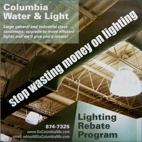
The second ad (on the left), however, didn't evoke the same reaction. This was an ad for Columbia Water and Light's Lighting Rebate Program. This is a great program, but, unfortunately, the photo just doesn't give the punch it should. It's not particularly eye-catching, and it doesn't immediately tell you what the ad is about. I mean, it's just an industrial ceiling with lights, sure, but also trusses and ductwork, all equally prominent, and a cluttered look. This isn't a bad ad, don't get me wrong, but it isn't great, either. And to improve it, all you would need to do is change the photo.

So I decided to give it a try. I spent about 2½ hours total putting together the ad to the right. It is the same size as the original, with the same text, in as close to the same font as I could produce. All I did was change the photo and re-place the text in the ad. Now we have a high-contrast image that grabs your eye with its incongruities, while immediately getting the message across - burning money in a light bulb. Maybe it's just me, but I think this ad has a lot more punch.
It's critically important to use the right images in your marketing materials. Sometimes you can make do with stock photography, but to really get the message across, it's best to feature your products in a professional image that can successfully compete for attention in a sea of images. That's what commercial photography is all about - and why I love it so much!
For more details, including how the revised ad was constructed, please see the longer article here on my website. Happy shooting!
-Art
Back to The Photographer's Journal
| ©2008 ArtSmith Photography, all rights reserved. | Home • Portfolio • About ASP • Capabilities • Pricing • Contact • Journal |