Commercial Photography · Aerial Photography · Studio Rental · Classes |

I was leafing through the Spring issue of Inside Columbia's CEO magazine, looking at (what else?) the photography in their ads. Two ads in particular caught my eye, but for different reasons. The first was an ad for the upcoming Wine and Food Festival (on the right),
This is a great example of a really strong commercial image. It catches the eye, and leaves you immediately aware of what the ad is about: wine, in this case. It is contrasty and colorful, with good diagonal lines and a great sense of motion. Just the perfect picture to accompany this ad. I don't know who took it - if it was a local shot done for the ad, or if it was just a stock photo, but in any case it is the perfect shot, in my opinion.
In more detail, the color of the wine is warm and inviting, dark enough to contrast with the light background, but not so dark as to loose its saturation. The stream of wine and the splash in the glass give a tremendous sense of motion that really attracts the eye. There's a reason you see so many pouring and splashing liquids in ads!! It's also well sized and well placed, so that it doesn't compete with the text, but rather the text can flow around it and over it (especially at the bottom). They even did a good job of matching the colors of the text and the wine so that the whole ad had a sense of completeness. This is just a really well-executed use of commercial imagery.
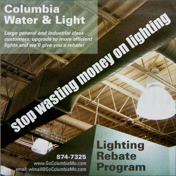
The second ad (on the left), however, didn't evoke the same reaction. This was an ad for Columbia Water and Light's Lighting Rebate Program. This is a great program, but, unfortunately, the photo just doesn't give the punch it should. It's not particularly eye-catching, and it doesn't immediately tell you what the ad is about. I mean, it's just an industrial ceiling with lights, sure, but also trusses and ductwork, all equally prominent, and a cluttered look. This isn't a bad ad, don't get me wrong, but it isn't great, either. And to improve it, all you would need to do is change the photo.
If you were to do just a basic improvement of the shot, without changing the idea of the ad, you would want to find a plainer ceiling - one without all the distracting trusswork and corrugated texture, and especially without ductwork. The focus is supposed to be on the lighting, after all, so make sure that's what you see. The only lights in this ad are overexposed and take up just a small percentage of the image space. To an extent they did a good job of disguising the ductwork by using it as a background for the text, but it also makes you wonder if that is somehow important to the ad, too. There's just too much going on in the ad, and to little of that has anything to do with the subject. On top of that, the image doesn't pop. It's static (no apparent motion), with bland contrast, and dull colors. The text is good and visible, but that's just not enough to save the ad, in my opinion.

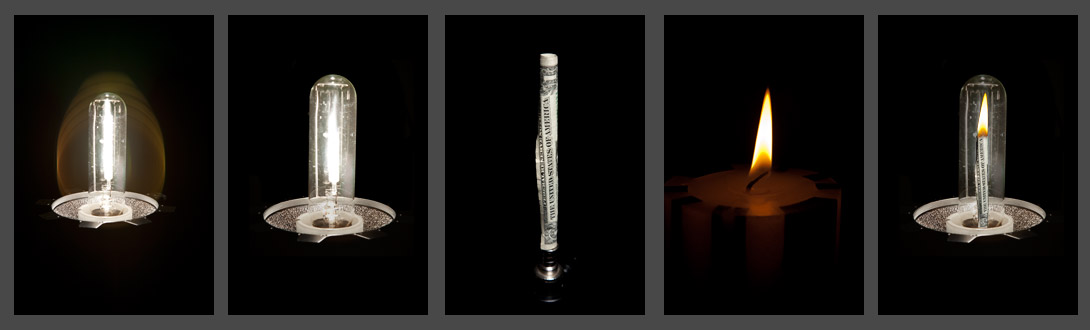
So I decided, if I was going to criticize the ad, I needed to show I could do better. I spent about 2½ hours total in the studio and at the computer putting together the ad to the right. It is the same size as the original, with the same text, in as close to the same font as I could produce. All I did was change the photo and re-place the text in the ad. Now we have a high-contrast image that grabs your eye. There's some apparent motion with the flame (though admittedly not as much as the pouring wine), and there's a sense of incongruity, both in a flame inside a lightbulb, and the apparent burning of money. There are no distractions in this image — you immediately get the message across: you are burning money with your lighting. Maybe it's just me, but I think this ad has a lot more punch.
So, how did I do this photo? It's actually a composite of three separate images. The first of a 500 W studio light, without it's reflector or softbox - those are just distractions. The original image is shown at the far left of the below images. I at first thought I'd like the lens-flare you see in the shot, but I later decided it was distracting and didn't add to the shot, so I removed it in the postprocessing, as seen in the second image. Later I toned down the bulb's brightness relative to the base, and took out a lot of the glare - it obscured the money too much.
Next I took a dollar bill (really it should have been a $100 bill, but I don't carry those, somehow!), and rolled it up and secured it with a little tape. Stuck it on a light stand and snapped a picture of it with very plain lighting (see the third image). Ideally, I would have played more with this image and made it more recognizably money while still keeping it to a shape that would fit in the bulb. That's something I'd do for a client, but for a quick and dirty experiment, I decided this was good enough.
Finally, I took a picture of a candle I had at the studio, concentrating on getting a good exposure of the flame (not the candle itself). This is in the fourth image, below. None of these were particularly challenging shots, but they gave me all the pieces I needed. Next I brought them into photoshop and started editing. I trimmed the dollar bill image to just the dollar, resized it to fit in the bulb and added it as a layer on top of the filament. I had to do a little erasing at the bottom to make it look like it was behind the ceramic base, but otherwise it was a simple overlay. Then I took the flame image, removed everything but the flame itself and placed it on the top of the bill. This took a little playing because the edges of the flame faded to black - actually darker than the envelope of the light bulb. A little erasing and blending took care of that, however. As I already noted, I toned down the brightness of the glass of the light bulb, and ended up with the finished image I needed (rightmost image, below). Then it was simply a matter of finding appropriate fonts to match the existing ad, and placing the text. I didn't do anything particularly creative there, after all, I'm showing how important the image is.
It's critically important to use the right images in your marketing materials. Sometimes you can make do with stock photography, but to really get the message across, it's best to feature your products in a professional image that can successfully compete for attention in a sea of images. Your images have to pop. That's what commercial photography is all about - and why I love it so much!
Good luck and happy shooting!
Back to The Photographer's Journal
| ©2008 ArtSmith Photography, all rights reserved. | Home • Portfolio • About ASP • Capabilities • Pricing • Contact • Journal |